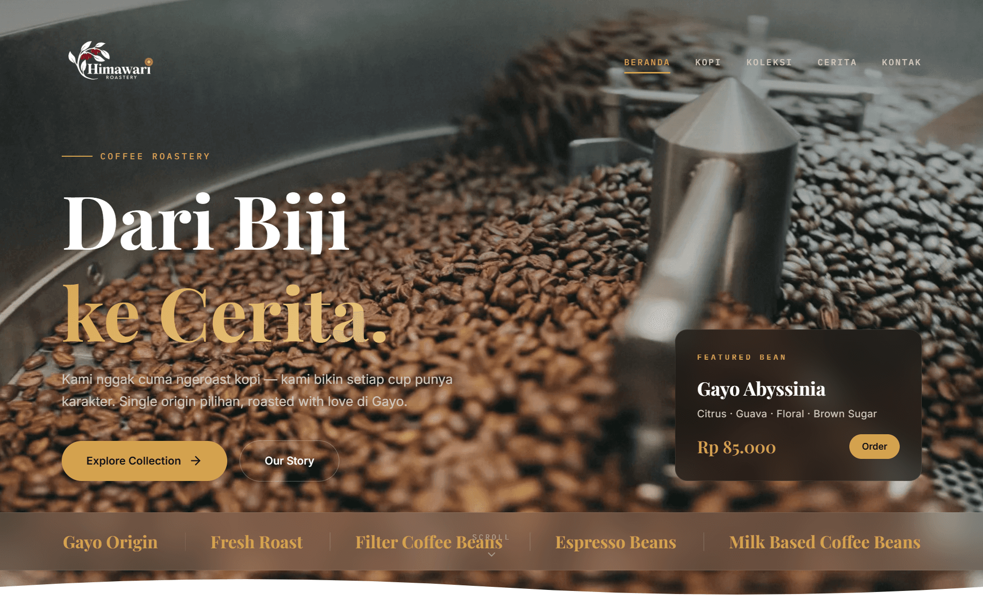
People buying coffee online cannot smell it or taste it first. They have to work with the information on the page: origin, processing method, roast profile, and a description of the flavour. That was my starting point for Himawari Roastery, a website for a roastery focused on single-origin coffee from Gayo, Aceh.
I worked on the interface design and web development, from the introductory pages to the ordering flow. Claude Code and Codex assisted with development, including translating the coffee bean visual concept into objects built through code. This case study covers the reasoning behind those choices and lessons that could be useful on similar projects.
Start with the buyer’s questions
For someone familiar with specialty coffee, a region name is only the beginning. They may want to know the processing method or whether a roast suits filter brewing or espresso. Someone buying specialty coffee for the first time needs simpler explanations to make a choice without learning every term.
Product information and educational content therefore serve different purposes. Product pages help people decide, while the coffee and Gayo pages provide context for those who want to read further. My takeaway is to decide which questions each page needs to answer before working on its appearance.
Making room for the coffee and its story
The visual direction pairs a quiet layout with dark backgrounds, cream text, and warm gold accents. Playfair Display handles headings, Inter handles longer passages, and IBM Plex Mono is used for technical details. Those roles help separate narrative, product information, and specifications when someone scans the page.
The coffee bean visual gives the eye a point of interest between text and product photography. People who already know what they want still need an easy route to the catalogue and order button. For me, the design needs to help visitors understand the product and see what to do next.
The 3D object concept, with help from Claude Code and Codex
I used Claude Code and Codex to explore ideas and assist with implementation. That included the coffee bean object concept: translating its shape, sense of depth, and movement into code. Setting the visual direction and deciding which results to use remained part of my work.
The visual approach is procedural. Shape and movement are calculated through code and canvas, reducing the need to download a large 3D model. In this context, a 3D visual means a sense of volume built mathematically. The process differs from sculpting an asset in a modelling application and exporting it for the website.
What I find useful about working with AI is how quickly an idea can become something visible. An initial version makes it possible to judge whether the shape fits the brand, whether the movement is distracting, and whether a detail is worth keeping. AI output still needs to be reviewed within the actual page.
I also do not treat a successful compilation as proof that the work is finished. Type checking catches some mistakes, but it cannot tell me whether the bean looks right or the interaction feels comfortable. Those questions require visual judgment and browser testing.
Animation has a cost
An object that keeps moving keeps the browser working. To limit that work, animation is monitored for visibility: when its section leaves the screen, the render loop pauses. Reduced motion preferences are also taken into account for people who limit movement on their devices.
Product images are handled separately through Vercel Blob and Sharp processing into multiple sizes. The aim is to avoid serving a detail-sized file for a small catalogue image. These are implementation choices to control page workload, rather than evidence of identical performance on every device. I have left out FPS figures and speed scores because this case study does not include measurements to support them.
The buying flow continues after payment
The order flow does not require buyers to create an account. A product selection can pass directly into the ordering flow, saving the buyer from choosing it again. Shipping costs are calculated with RajaOngkir through Komerce, using destinations down to subdistrict level.
Payment options include DOKU and manual bank transfer. A manual option creates follow-up work: the buyer uploads payment proof, an admin reviews it, and the order status is updated. WhatsApp notifications through Fonnte and email through Resend help communicate order progress.
The lesson here is practical: checkout design needs to include the admin’s work. A short payment screen only solves part of the problem if the store operator struggles to match payments to orders. Status information and verification steps need to be as clear as the buyer’s form.
Content that can be managed after launch
Next.js and React handle pages and interactions, while Payload CMS provides a place to manage content and operational data. Turso is the database. This separation helps the store operator update information without changing page code whenever a product changes.
Product data also informs metadata and structured data. I treat this as a way to keep machine-readable information consistent with what people see on the page. Schema implementation is not a promise of search rankings or a guarantee that review stars will appear on Google.
What I would carry into the next project
Himawari brought interface design, interactive visuals, and store operations into the same set of decisions. A coffee bean object can attract attention, but product information still has to help someone choose. Checkout needs to be usable, and the process behind it needs to be manageable for the store operator.
Claude Code and Codex helped turn concepts into implementations I could inspect and refine. Their value was in making it easier to try things and iterate. Deciding what belongs on the page, what needs simplifying, and what still needs testing remains the responsibility of the person building the website.